eCARE 21
A market-driven brand refreshSERVICES:
BRANDING | UI/UX DESIGN | DEVELOPMENT
Time is of the essence
eCare21 was at a pivotal moment, transitioning their business model and looking for a website and updated marketing materials that would celebrate and capture the legacy of the organization while keeping an eye on future endeavors. Given it was the company’s first brand refresh, it was crucial to do it right.

Words really do matter
The rebrand process involved revisiting existing content while focusing on the value of the software and service and reimagining eCare21’s overall positioning in the market.
Gregory FCA started by interviewing key stakeholders to gather insights. We explored business objectives, value props, needs, audiences for the website, as well as the eCare21 brand and the experience of partnering with them.
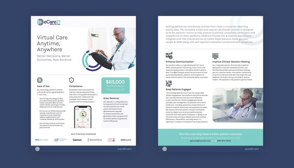
From there, our content team wanted to ensure this tech-driven organization could clearly communicate who they are, what they do and the audiences they serve. It resulted in key messaging documents as well as website and marketing content.

A breath of fresh air
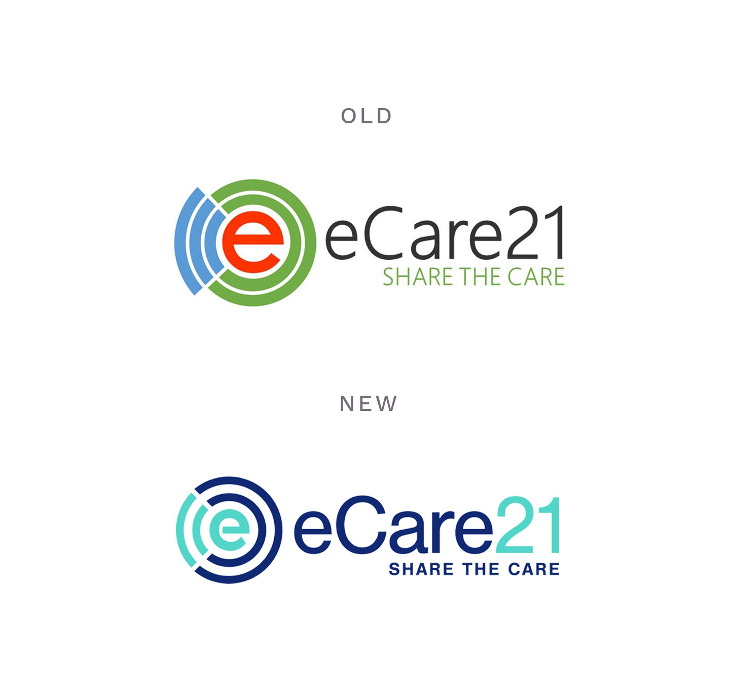
Internal team members felt they needed an updated logo, but the organization was not ready for a full redesign of their visual identity. They felt an evolution of the old logo would help move the process along and into a more comfortable state of relevancy. The Gregory FCA team maintained the integrity of the mark but went with an updated color palette and a more modern typeface to complement the newly designed website and marketing materials.

An interactive upgrade
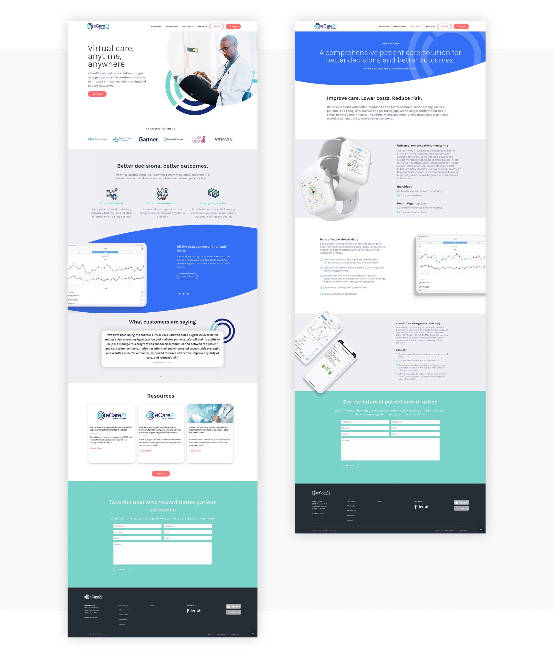
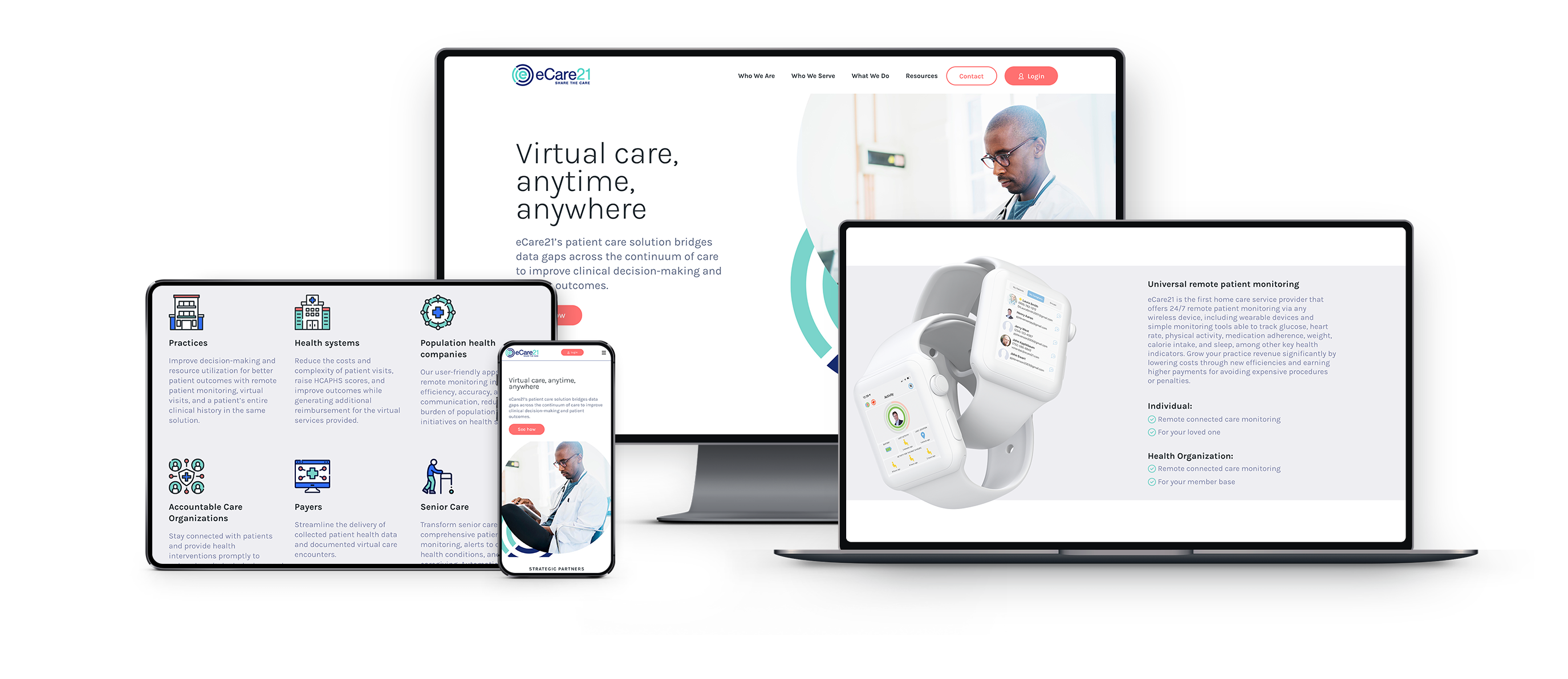
With an impressive arsenal of products and services, it was imperative to streamline the UX and site architecture to give users a clear siteline to their interests. The main goal was to highlight key features and bring them to the forefront of the website and allow users to easily find if eCare21 could address their business needs. Strategically placed calls to action were placed throughout the site to increase lead generation and boost momentum.
