MARINUS REBRAND
Standing out in a sea of competitorsSERVICES:
BRANDING | SOCIAL
A new chapter
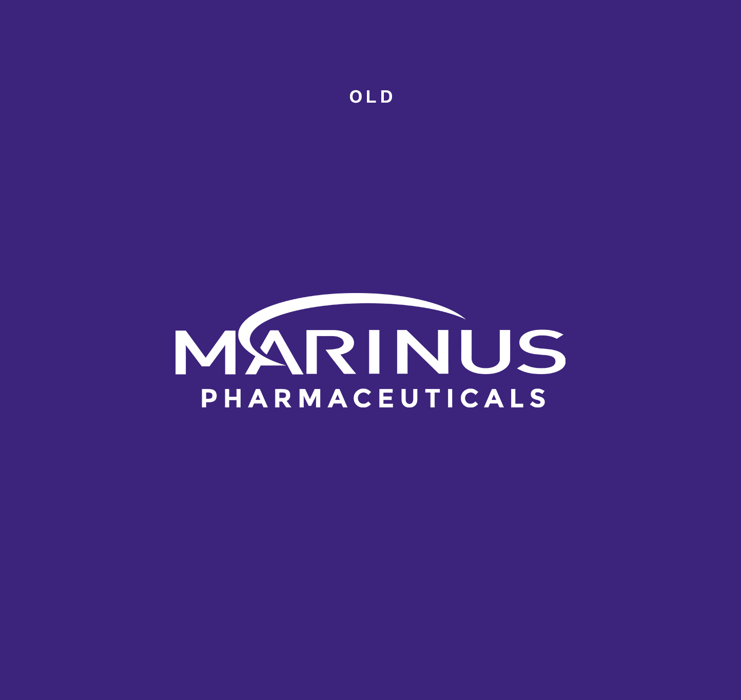
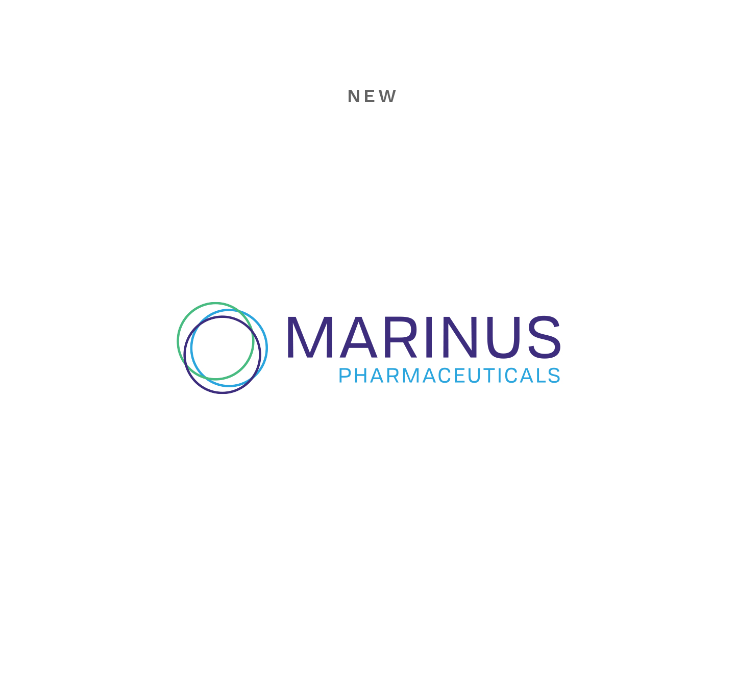
Since its inception, Marinus has been committed to improving the lives of patients suffering from drug-resistant seizures and neuropsychiatric disorders. Marinus was looking to get away from their outdated brand and move to a direction that was more reflective of the company as it exists today. To help their business grow into the next phase, we were asked to design them a brand new logo.
Step by step
We took a phased approach to collaborate with the Marinus team. Which took us from the Discovery phase to understand the market and segment to a Visual phase where we created concepts based on the initial brief and competitor analysis. In the Creative phase, the client then selected their preferred route from a range of concepts and landed on a logo that represented them and their 3 core principles. We then developed, dialed in the final product and delivered all files and artwork so that new office graphics and swag could be created.
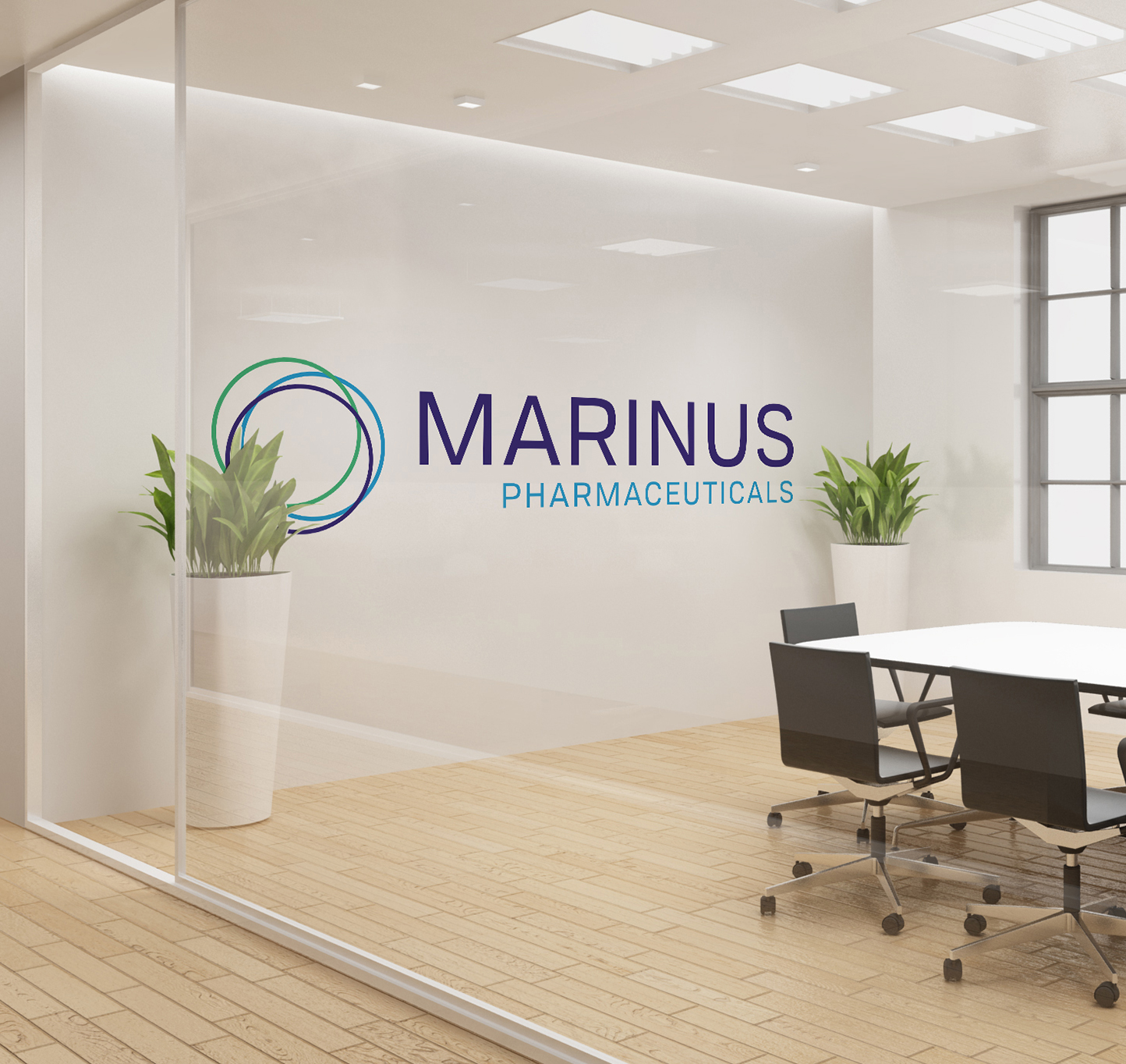
A logo rooted in culture
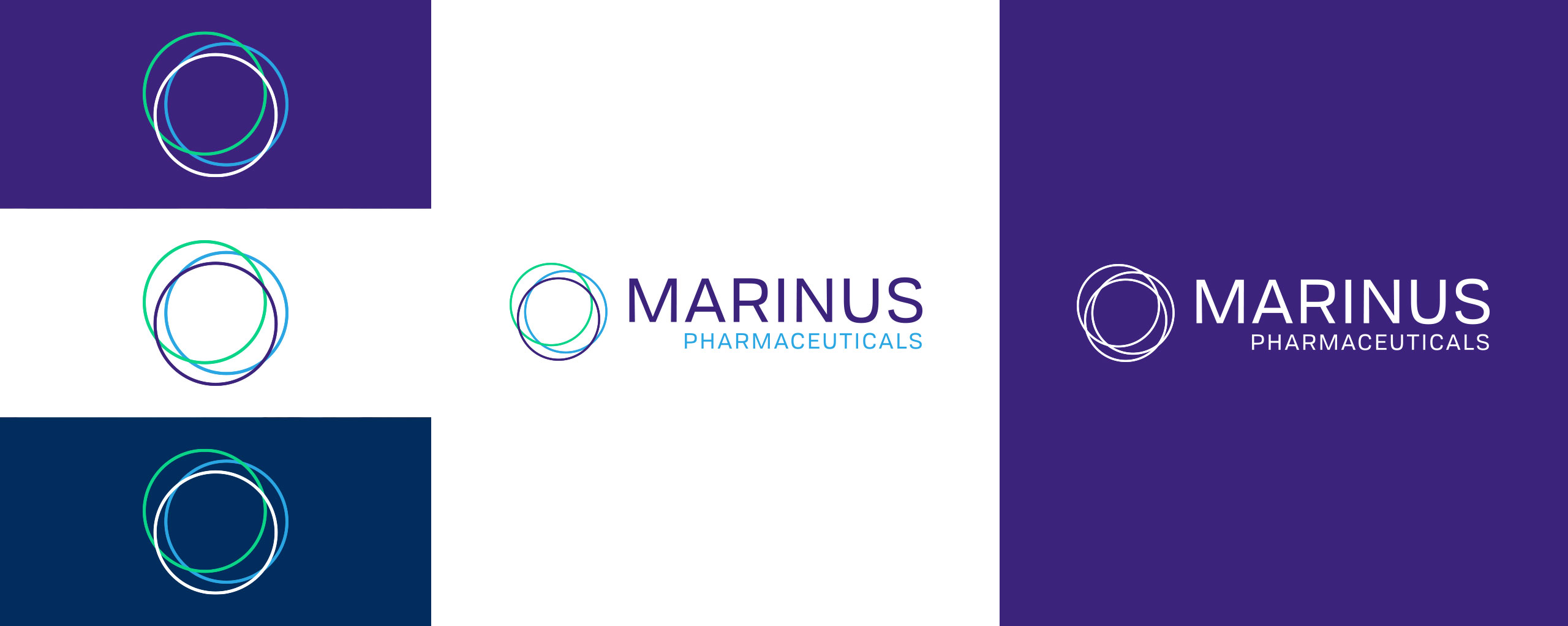
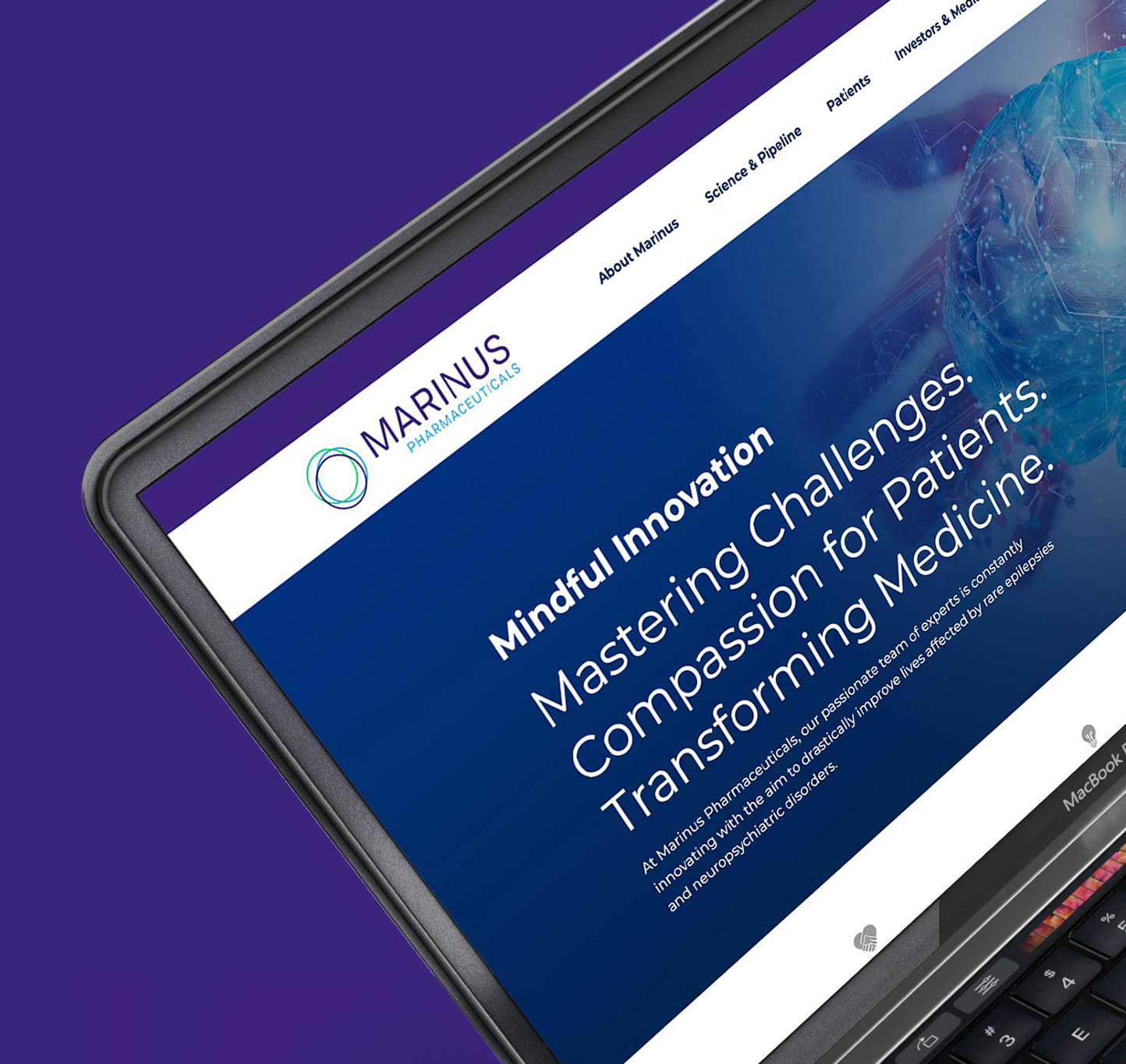
The rings are simple and pay homage to the core company values (commitment, innovation, community). The typography is dynamic, modern and puts Marinus in a relevant position for years to come. The color palette is vibrant, full of energy and translates seamlessly into all print, digital, and social executions. With a new identity in place, it breathed new life into their vast arsenal of marketing assets.
