MERIT FINANCIAL ADVISORS
Modernizing a legacy brand on a path for explosive growthSERVICES:
BRANDING
A brand evolution with strong roots and an eye toward the future
Merit Financial is a renowned financial services firm with a strong culture, clear vision for the future and an appetite for growth.
Over the last two decades, Merit has become known for its work with individuals in transition – those experiencing a major life change, such as a divorce, death of a spouse, selling a business, or achieving retirement goals. This focus has become a cornerstone of the business, and the Merit team helps clients create a bridge to a new phase of life, partnering with clients as they evolve their lifestyle and goals.
Merit was eager to refresh their identity to better reflect the team’s mission and philosophy, modernize its market presence and position it for future growth. We were asked to partner with them in designing a new logo and brand color palette that positioned them for the next 20 years of growth.

A well-designed plan
We designed and executed a multi-part plan to envision the evolved Merit brand and meet the team’s objectives. The process was rooted in a collaborative approach between the teams.
Gregory FCA engaged in a deep discovery process to define its core messaging and value proposition in the marketplace, as well as a thorough competitive analysis.This process allowed our team to isolate core messages and themes that anchored the brand and laid the foundation for the design process.
The creative team extrapolated key takeaways from the discovery phase to inspire the design. The process yielded six design concepts, all reflective of the team’s core principals, transition- and bridge-oriented imagery and concepts, and a modernized color palette.
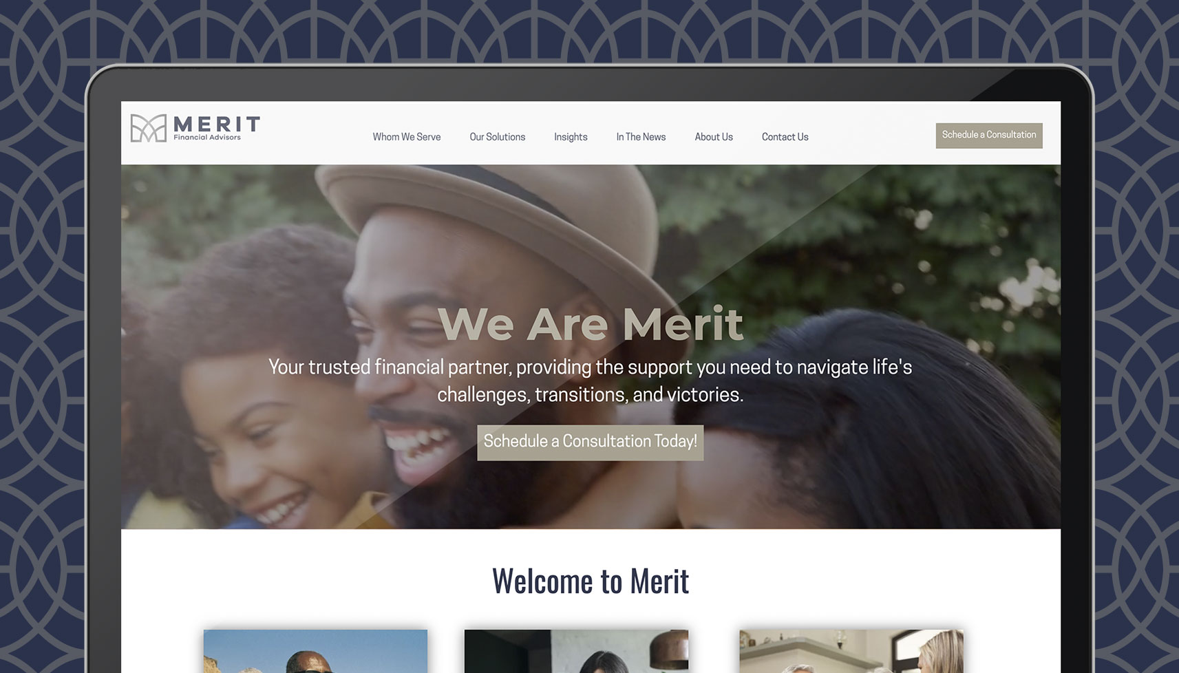
We incorporated feedback from the Merit team and its key stakeholders throughout several rounds of revision and refinement to ultimately design the final product. We developed and delivered all necessary files and artwork for the Merit team’s use and implementation in their refreshed website, signature lines, business cards and other marketing collateral, bringing the brand full circle.
A reflection of the brand evolution and promise for the future
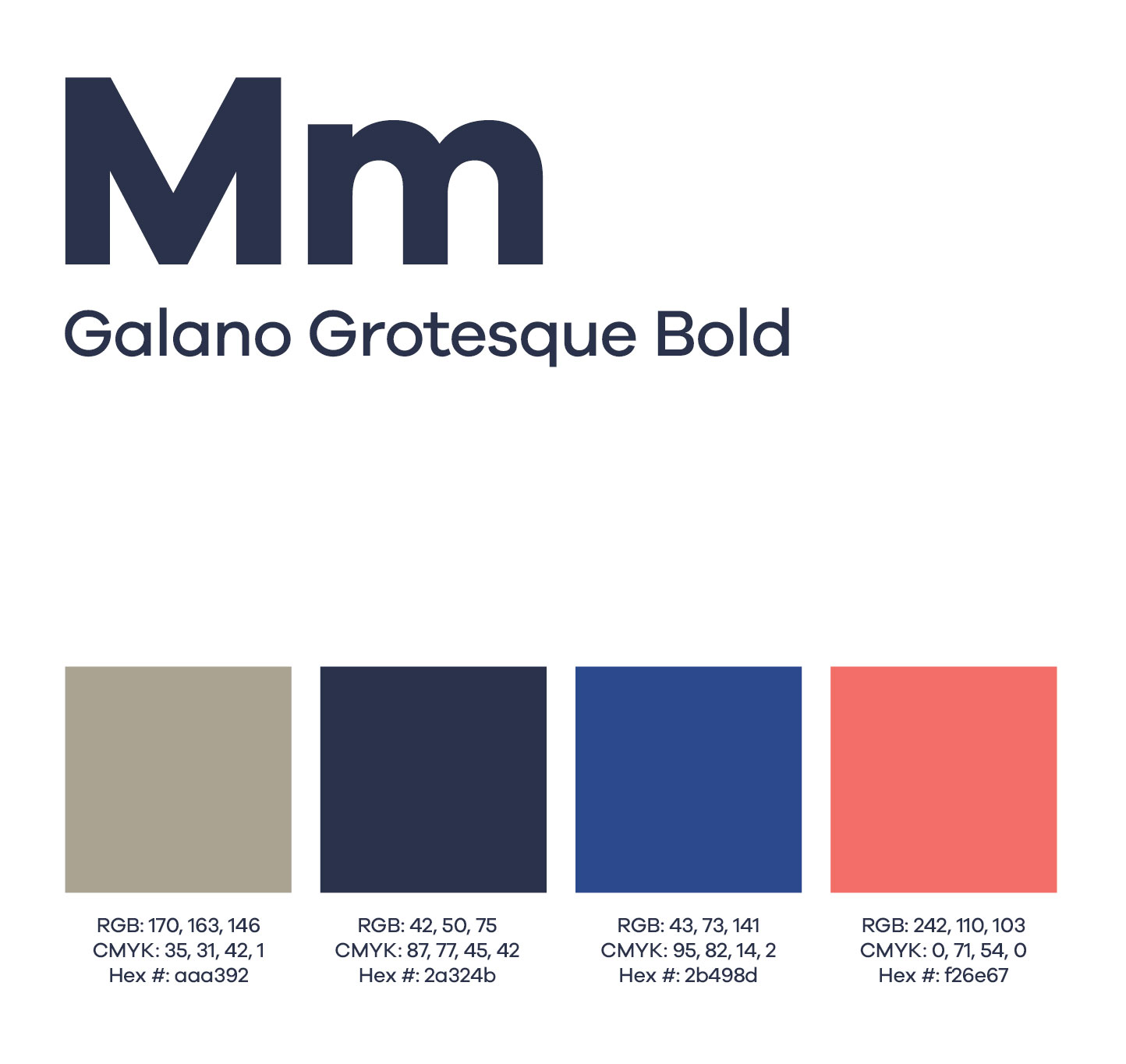
The logo is anchored by the signature mark, which offers a modern capture of Merit’s monogram and a contemporary take on bridge-inspired artwork. The mark, typography and color palette are modern and fresh, while maintaining the refined elegance associated with the financial services brand. The design and colors were intentionally chosen for integration on digital, print and social assets, as well as for branded apparel and assets.
